|
Current position for Active portion of portfolio: SELL – S.T.A.Y. Plus™ What difference do you see between the two graphs below? Both are 10 months of data and both have over a 20% decline from highest to lowest point of the graph. Both achieved a successful rally o f over 50% of the previous decline. (Updated through the week ending 2/17/2023). 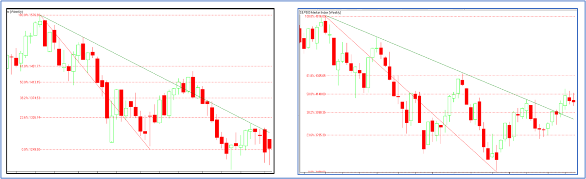 Quiz Answer: The chart on the right is our current YTD chart of the S&P500 updated through 2/17/2023. The chart on the left is the same ten-month time frame from October 2007 to August of 2008. Would you like to see the rest of the left side chart? See Below: That was the Bear Market of 2007 – 2008 with over a 55% loss. Both charts show results for six weeks following the previous low. In 2008 it went for three more weeks before the bottom fell out. Therefore, we will soon know if history will repeat itself or not. 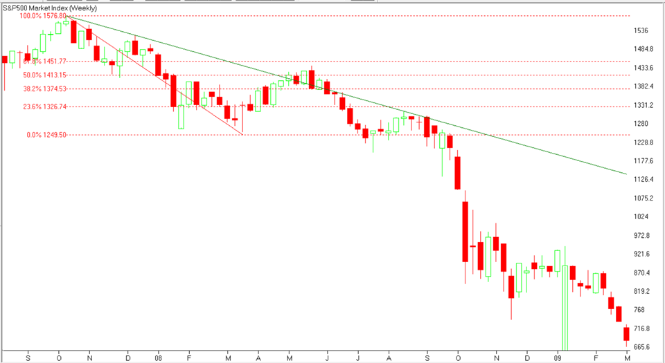 Comments are closed.
|
208.376.0091Disclaimer: past performance is not a guarantee of future performance. © Copyright - Advanced Financial Solutions, Inc.
|