|
Current position for Active portion of portfolio: SELL – S.T.A.Y. Plus™ New SELL Signal, equities move to inverse. For the last three months, the rally coming out of the April downturn as seen in the chart below, price has been moving up and momentum moving sideways or down. The green & white lines are short-term & long-term moving averages respectively (see the MACD below). When they become more parallel, the market momentum is waning- even though the market may still be moving up. We like to use an aviation analogy because this situation is like an airplane that is climbing but the air speed is declining. Unless a lot of power is added, the plane will surely change it's trajectory in the downward direction. That is why this market condition always leads toward either a massive increase in momentum (adding power) or a decrease in price (downward trajectory). With these and other technical indicator conditions developing, it only took a few down days to trigger our SELL signal. This and several other technical indicators led to a confirmation of the SELL signal. The market, for the most part, has been in a healthy uptrend, maintaining price well above the 20-day moving average, but when the 20-day moving average was broken, it indicated that the current short-term trend is in flux. The market may consolidate for a period of time and then resume the up-trend, or it may find its way further down towards the 50 day moving average. Time will tell. In the meantime, we will remain in the inverse position with equities until the new trend is determined. For those self-managing their 401k off of this signal, we recommend moving to a "cash" or money-market position. Weekly S&P 500 Chart (with all-time hi shown)  Monthly S&P 500 Chart (with all-time hi shown)  S.T.A.Y.™ current position for Active portion of portfolio: BUY – S.T.A.Y. Plus™ Last week the Small and Mid-Cap indexes made some major moves to begin narrowing the gap between all of the indices. The Small Cap (Magenta) and Mid Cap (Red) made weekly gains of 4.33% and 2.92% respectively compared to only a .92% gain by the S&P500 (Green) and a -.27% loss by the Nasdaq (Light Blue). This is nice to see since they have been lagging behind the high-flying S&P 500 and NASDAQ indices YTD. The growing divergence that we talked about in our July 1st update made a major turn last week towards closing that gap. The Average (Yellow Line) made a gain for the week of 1.98%. The charts below show the growing divergence YTD and also a zoom in of last week that shows the Small and Mid-Cap indexes making a move that could start closing the divergence which is what usually happens over the longer term of market time frames. The yellow line shows the weighted average of all indices which also represents the equity exposure that we have with S.T.A.Y. Plus™. By equally weighting into each one, we obtain the broad market exposure that is desired regardless of which sector happens to be decreasing or increasing at any given time. These divergences most often, over the long term, will consolidate closer together for most of the longer market time frames. All Four Market Indices Used by the STAY Plus™ Strategy (Spans last week)  All Four Market Indices Used by the STAY Plus™ Strategy- Yellow is the Average (YTD)  Weekly S&P 500 Chart (with all-time hi shown)  Monthly S&P 500 Chart (with all-time hi shown)  S.T.A.Y.™ current position for Active portion of portfolio: BUY – S.T.A.Y. Plus™ Market pushes higher on shorten week. The market continued to push higher into new all-time highs last week. So far this week, the exuberance has softened, but is still in positive territory. We are keeping an eye out for signs of weakness and will take action accordingly. For information on our exposure to the market using four different indices, see last week's post. Weekly S&P 500 Chart (with all-time hi shown)  Monthly S&P 500 Chart (with all-time hi shown)  S.T.A.Y.™ current position for Active portion of portfolio: BUY – S.T.A.Y. Plus™ Continue to be Cautiously Optimistic Last week the S&P500 made yet another new high but ended the week with a small loss. However, there continues to be a growing divergence between the market rally of the technology sector, especially the AI market, and the remainder of the market. Over the last two months the Mid-Caps and Small-Cap indexes have been significantly lagging the tech-heavy S&P500 and the Nasdaq which is heavily weighted with technology stocks. The chart with the black background shows the divergence that is currently happening. The yellow line shows the average of an equally weighted portfolio of all four of the equity indexes that we are invested in: The QQQ – technology, VOO The S&P500, VO The Mid-Cap index, VB The Small-Cap index. You can see that the yellow line, representing the results of our equity portfolios is obtaining an equally weighted average of all four of these indexes. It’s not a matter of trying to switch from one to the other, because there are market periods of time where instead of QQQ leading the pack, VB (Small Cap) could be leading the pack. By equally weighting into each one, we accomplish obtaining the broad market exposure that is desired regardless of which sector happens to be decreasing or increasing at any given time. These divergences have tended to consolidate over longer time frames. The STAY Strategy's four Market Indexes  Weekly S&P 500 Chart (with all-time hi shown)  Monthly S&P 500 Chart (with all-time hi shown)  S.T.A.Y.™ current position for Active portion of portfolio: BUY – S.T.A.Y. Plus™ Cautious Optimism Continues Last week the S&P500 made another modest gain of about ½% and established another new high of 5505. The market ended the week with a couple of slightly down days as it starts to “catch its breath” from what seems to be a slightly overextended rally. Although we remain cautiously optimistic, technically we have a series of higher highs and higher lows since November of 2023. So, the bullish uptrend continues to be well intact. If you look at the charts, you will notice that last week the market continued upward again for the 3rd week in a row. In the last 9 weeks, 7 have been gainers, and one of the two down weeks was essentially neutral, making this a fairly steady upward trend. On the monthly chart, April has been the only down month since last October. The market isn't showing any signs of changing it's trajectory at the moment, however, things can change rapidly. We will continue to monitor it and stay invested until there is a material change. Weekly S&P 500 Chart (with all-time hi shown)  Monthly S&P 500 Chart (with all-time hi shown)  S.T.A.Y.™ current position for Active portion of portfolio: BUY – S.T.A.Y. Plus™ Continue to be Cautiously Optimistic Last week the S&P500 made a modest gain of about ½% and established a new high of 5463. Though this would be considered a bullish breakout there is still some concern about the market breadth. Most of these gains were due to high-tech companies and especially in the AI (Artificial Intelligence) stocks. The broader market on the other hand is not sharing the same enthusiasm, when contrasting this with the equal-weighted S&P 500, the broader market appears less robust, suggesting a consolidation phase rather than a strong breakout, signaling caution amidst the optimism. We will continue to proceed with cautious optimism. Weekly S&P 500 Chart (with all-time hi shown)  Monthly S&P 500 Chart (with all-time hi shown)  S.T.A.Y.™ current position for Active portion of portfolio: BUY – S.T.A.Y. Plus™ Cautiously Optimistic Over the course of the week, although initial selling pressures emerged on Monday, Tuesday, and Friday, the market demonstrated resilience by recovering each day. This consistent buying pressure was instrumental in driving the market above the 5350 level on Wednesday to a new all-time high. This rally was predominantly driven by significant gains in large-cap tech stocks like Meta, Apple, Google, Amazon, and Nvidia, indicating a preference for large tech-oriented investments amidst the broader market dynamics. However, when contrasting this with the equal-weighted S&P 500, the broader market appears less robust, suggesting a consolidation phase rather than a strong breakout, which signals caution amidst the optimism. By way of review, you can see that we have included two different charts. One is a "Weekly" chart of the S&P 500 index (AKA "the market"), and the other is a "Monthly" chart of the S&P 500 index. Each bar represents the aggregation of either a week or a month's activity. The top of the red bars represents the opening price and the bottom of the red bar represents the closing price of the market in that corresponding time frame. The green bars are just the opposite; top is the closing price, and bottom is the opening price. The wicks on the top and bottom represent any trading in that period that is outside of the opening and closing bounds. We include these charts so that you can see what the market is doing with some greater context. Feel free to hit us up with any questions on how to read these charts. Weekly S&P 500 Chart (with all-time hi shown)  Monthly S&P 500 Chart (with all-time hi shown) 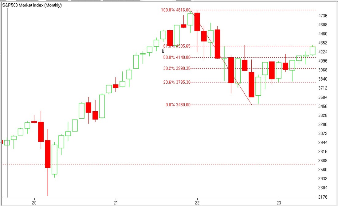 S.T.A.Y.™ current position for Active portion of portfolio: BUY – S.T.A.Y. Plus™ Hesitating in a Trading Range After a three-week correction from a four-month uptrend, the market has regained the three-week downturn. However, for the last three weeks the market has been moving back and forth in a range from about 5200 to 5340. If the market is going to continue upward, we are going to need to see a breakout that holds above the 5350 level before possibly proceeding on to new highs again. Time will tell. We will start showing our current position as the current short-term position and clients who are making changes in their 401k accounts can act accordingly just knowing that the positions from BUY to SELL may be happening more often than pre-2022 signals. By way of review, you can see that we have included two different charts. One is a "Weekly" chart of the S&P 500 index (AKA "the market"), and the other is a "Monthly" chart of the S&P 500 index. Each bar represents the aggregation of either a week or a month's activity. The top of the red bars represents the opening price and the bottom of the red bar represents the closing price of the market in that corresponding time frame. The green bars are just the opposite; top is the closing price, and bottom is the opening price. The wicks on the top and bottom represent any trading in that period that is outside of the opening and closing bounds. We include these charts so that you can see what the market is doing with some greater context. Feel free to hit us up with any questions on how to read these charts. Weekly S&P 500 Chart (with all-time hi shown)  Monthly S&P 500 Chart (with all-time hi shown)  S.T.A.Y.™ current position for Active portion of portfolio: BUY – S.T.A.Y. Plus™ After a three-week correction from a four-month uptrend, the market has regained the three-week downturn. However last week the market ended with virtually no net gain after 3 slightly upward days and two significant down days. The market opened today with the same type of hesitation. If the market is going to continue upward we are going to need to see a breakout that holds above the 5350 level before possibly proceeding on to new highs again. Time will tell. Weekly S&P 500 Chart (with all-time hi shown)  Monthly S&P 500 Chart (with all-time hi shown)  S.T.A.Y.™ current position for Active portion of portfolio: BUY – S.T.A.Y. Plus™ Market Achieves New All-time high After three weeks of downturn that started in early April, the market has regained those losses and pushed above the previous all-time high. Currently the market is testing new all-time highs but with some hesitation. Time will tell. We will remain invested in the market with a keen eye towards a trend changes that may trigger a change in out position. By way of review, you can see that we have included two different charts. One is a "Weekly" chart of the S&P 500 index (AKA "the market"), and the other is a "Monthly" chart of the S&P 500 index. Each bar represents the aggregation of either a week or a month's activity. The top of the red bars represents the opening price and the bottom of the red bar represents the closing price of the market in that corresponding time frame. The green bars are just the opposite; top is the closing price, and bottom is the opening price. The wicks on the top and bottom represent any trading in that period that is outside of the opening and closing bounds. We include these charts so that you can see what the market is doing with some greater context. Feel free to hit us up with any questions on how to read these charts. Weekly S&P 500 Chart (with all-time hi shown)  Monthly S&P 500 Chart (with all-time hi shown)  |
208.376.0091Disclaimer: past performance is not a guarantee of future performance. © Copyright - Advanced Financial Solutions, Inc.
|